I chose this image because i like how it is focused on the type, however it has a different background behind it. I took this image at an angle to capture the wire fence and trees behind it aswell as the type.
I took this image looking up at it, i did this simply because the sign is important and needed hierachy, therefore i panned the camera up at it to make it seem important.
I like the angle i have taken from this image, it makes it seem like i am looking up at Dunstable. I like how the font is Serif, this makes it seem more formal because it is a welcome sign.
I like the way that this text has been capitalised, this shows its importance, as it is a sign telling people where they are.
I like how i have panned this photo up slightly. However i dislike how the type has been right alligned and then the type at the bottom has been center alligned. This isn't very easy to the eye and your eye is immediately drawn to the 'At any time' which may be confusing.
I like this photo because of the wide range of colours, i have caught the scenery surrounded the type.
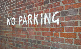
I like this graphitti because it has been done as a warning, i took the image from the side, making it look like the type is getting bigger.
I like how this text has been capitalised to show it's importance.
Again with this image i have panned it to the side to make it seem like it is getting bigger, this gives the text a different effect.
I like this image because it is the postcode for Dunstable, therefore it would be good to put into my calender.
I really like the font of this, because it looks slightly serif however it is sans serif.
I like how this type has been capitalised to show its importance.


No comments:
Post a Comment