Thursday 28 November 2013

Experimentation

Fot all of my experimentation, i either drew them by hand of using Photoshop/Illustrator.
I looked at a digital artist named Jasper Goodall. He gave me inspiration for my first illustration as he uses a lot of shapes and 'space' type feel images. I added a silhouette to give it an 80's feel as she has the glasses and is posing to give off the 'model look' I also used a silhouette as Goodall also uses a lot of silhouettes in his work and i think it looks really bold and sophisticated, especially in a poster it would be good for getting a point across.
I then moved onto putting the silhouette into one shape like Goodall has done in a piece of his work called 'Stallion main' I then added 'Save the world' and 'Katherine E Hamnett', as she was one of the designers at the V&A that gave me a lot of inspiration, i added a space like background and used the same silhouette. I really like this because it was just an experiment, but i think it works really well, and although i can't use this in my final because i have to relate it back to all of the exhibition and not just one designer... i like the use of the black background and white and red text, it really stands out and makes it eye-catching, i think this is something i need to consider in my final posters. The reason i used silhouettes is because i think it looks really effective and sleek. I got the idea to use silhouettes from the series of James Bond posters for the films shown below.


I like these James Bond posters because they look professional and i think the silhouettes give it a spooky/thriller edge. 


I then looked at Billie Jean, he did a piece called 'This year' which i really liked as he put images and text inside of text. I then recreated his piece in an 80's effect, putting 80's images and patterns inside of text. I really like this effect because it is vibrant and use of colour is vast, i also like how you can still read the 'I AM' even though it is quite busy with all the images inside of it.
I then proceeded to make it so it related to the exhibition, i put the images inside of the V&A logo, i really like this because on a white background it really stands out and has good use of colour, however the logo still really stands out and it's very eye-catching.

For all of my experimentation, i drew the illustration out on paper and then scanned it in onto the computer and used Photoshop to add colour and text. I like doing this because it means that it has my artwork swell as computer illustration added in.


Wednesday 27 November 2013

Syd Brak


Syd Brak studied at Johannesburg Art School, South Africa, before entering the world of Advertising as an Art Director for J Walter Thompson and McCann Erikson. He emigrated to the UK in the 70s to pursue a career in Illustration.
As pioneering airbrush artist, Syd produced two of the world’s best selling posters – 'Long Distance Kiss' and 'Hollywood Diner'.

Syd has worked for all the major advertising agencies, design groups and film companies in the UK and US, on campaigns from toothpaste to motor cars to puppets, food, fruit and animals.
He has won many awards over the years, the proudest having a gold medal award presented to him by Bill Bernbach.
 He began working digitally with a combined airbrush (90%) and computer (10%) technique.

I really like Syd's work because it is so bright and vibrant. I love the old-new kind of theme, and the effects he has used throughout his work. I also really like the contrasts, i think my posters would look interesting if i used his old/new technique to portray fashion.


Melissa Chaib

Melissa is an Illustrator and Graphic Designer.
She draws inspiration from things she reads, films and music, cities near and far,
Each piece is created using a mix of mediums including Photoshop, water-colour and ink.

I love Melissa's work because it is quite teenage-y and cute. I love the bright colours and sketchyness in her work, it reminds me of doodles that i used to do in my notebooks at school, however she has taken them further and edited them to make them look stylish.


80's day!


We decided to do an 80's day to give us a better view about the project we were starting. During the day we played lot's of 80's music and wore 80's clothes. We also did a catwalk as we were all dressed up, we painted these boards in 80's style to give us a better perpesctive on what the 80's were like! We used these boards to put beside/at the end of the catwalk to give it a good 80's vibe and make it exciting.
I thought the 80's day was a great idea, it opened my eyes to what the 80's was like, what they listened to, wore and what the design was like. I think everyone enjoyed it because it was a really interactive way of researching what the 80's were like, so that we had a better outlook for the project.

Billie jean


Billie Jean's work is one of my favourites. I love how he combines imagery with text and different manipulations. His work really sends out a message and he does it very well. I love all the different techniques he uses including; using typography with images inside, overlapping images and creating amazingly eye-catching pieces of work. I would definatley consider using something like this for my final posters as it is so eye-catching and can hit many different audiences.

Tuesday 19 November 2013

Club to Catwalk- About the Exhibition.

The exhibition that i went to look at was the "Club to Catwalk" at the V&A Museum in London.
The exhibition explores how the creative relationship between catwalk and club wear in the 80's helped reinvent fashion, as reflected in magazines such as i-D and Blitz and venues including Heaven and Taboo.
At the exhibition i saw over 85 outfits ranging from different artists. One of the artists that really caught my eye was Katherine Hamnett, she is well known for her political clothing and her Ethical business philosophy. I like her work because it has a real meaning and is very opinionated and i share the same kind of opinions with Katherine. I like the way that her clothing is straight to the point, using strong colours such as black and red and bold type to get the message across to people.
I also really enjoyed looking at Vivienne Westwood's clothing... Her work is based on neutral colours, however the shapeand the way the garments hang are very different from any i've seen before. A few of her garments also include Modern art. I espiecally like her "The machine collection" as she has aimed to emphasise a womans figure and make them feel strong and femininem however, still keeping it simple with a glam-rock feel. 
I also really liked Rosemary Moore's clothing as she uses Multi-purpose materials. I like how she used "rippled" textures for club, dance, swim and excercise wear. 
Overall, i really enjoyed the exhibition, i loved the atmosphere with the different types of 80's music playing and the videos of catwalks on the walls gave it a really lively feel. I also like how there was a room that you could go into that showed different slides of things happening in the 80's, with loud music playing, it really set the scene and gave it a fun feel.


Monday 18 November 2013

Keith haring

Keith Allen Haring (May 4, 1958 – February 16, 1990) was an artist and social activist whose work responded to the New York City street culture of the 1980s by expressing concepts of birth, death, sexuality and war. Haring's work was often heavily political and his imagery has become a widely recognized visual language of the 20th century.
I like Haring's work because it is so different and colourful. I've seen it before on adverts for food and drink, so i've seen his work before. I like how it is quite sketchy however it's very bold and eye-catching and good for advertisement.


Jasper Goodall

Jasper Goodall was born in 1973 in Birmingam, England.
His Father was an architect and his mother a fine artist and photographer who was instrumental in the UK Feminist Arts Movement during the 1970’s/80’s.
He Graduated from The University of Brighton in 1995.

Goodall was at the forefront of the reinvention and rejuvenation of illustration in the late nineties and helped pave the way for the huge resurgence of the medium that we have witnessed in the last ten years. His iconic work for The Face magazine has influenced so many image makers, it has almost become a school of illustration in itself.
His client list encompasses many areas- music, fashion, advertising, publishing and Editorial.

I love how jasper uses a wide range of colours in his designs, however mostly uses white/black backgrounds to make his illustrations really stand out. i like how he uses shapes to create images and he uses a lot of effects to make his work look innovative and interesting. I'm definitely thinking of using shapes and effects in my posters to really make them stand out and give them an 80's effect so that it relates back to the exhibition in which i am designing for.


Creating a series of graphical advertising posters

The aim and purpose of this brief is to discover how imagery is used in a wide variety of graphic disciplines including print and digital media. Designers need to be multi-disciplined, adaptable and understand the software tools that are available to them, including typographical and illustration packages so that they are able to create innovating and exciting visual communications.

Evaluation


For this brief, I was asked to rebrand the Dunstable College Refectory. My client was Wendy Gault, the owner of the Refectory.
These were her requirements:
She wants us to include:
-A logo
-Strapline
-Signage for advertising
-Opening/closing hours signage
-Signage for the menu's with all of the products on offer 
-Welcome signs
-Signs to show which way the Refectory is (directions)
-Signage promoting their healthy options/cold breakfasts/salad bar
-A quirky and colourful branding-Something like Costa/Starbucks, i.e. simple, effective, attractive, eye-catching
-Must be to fit in with the target audience for both teenagers and the adult staff
-Also need to think about students who have learning disabilities, how can we make the refectory better for them?
Restrictions and constraints:
-No covering of the windows, focus on the walls
-Low budget
Overall, I liked my final pieces; I think they look sophisticated yet simple and still well aimed at teenagers/adults because of the simple colour scheme of black and white, with the added college colours that then related it back to the college itself. I think my logo ideas and signage work well, I think they answer the requirements that I have been given and I have taken into consideration all of the concepts that Wendy gave us and put my own twist on the design part of it. 
I found some of it quite difficult as I had not designed any signage before so I did have to research quite a lot of other refectory’s/cafĂ©’s to get a feel of what kind of signage is used/appropriate. I also found aligning everything quite difficult as I am not used to doing it, however I got the hang of it and was able to align everything properly so that it look professional. I also struggled with some of the software, the font I used would not install on my laptop and I had a few issues with the images that I had used, but in the end I made sure that the images I used had no copyright issues.
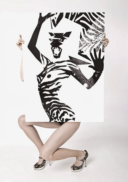
I looked at quite a few artists that really inspired me, but because I had to use a certain font, I couldn’t recreate some of the typographers work that I liked… However, in one of my logo’s I did decide to change the font to make it how I wanted (rubbed parts out). I also looked at artists who use type to make an image, which I used in my final wall design, which is one of my favourite parts of my designs. I also looked at some menu designs and really liked the idea of blackboards as they are a cheap and effective way for menus, however I used them for signage and if I was to go onto create menu’s then I would definitely consider using blackboards. Also, looking at Kate Morros, who designs logo’s that are mainly in black and white, or containing black and a brighter colour such as pink… I really liked her work and in two of my logo ideas I reflected on her work by using black and white and with one of my logo’s I decided to use black and the pink colour from the CBC branding.
If I were to do it again, I would take more care in getting all my final pieces finished to a high standard, because I took so much time working on the layouts and my ideas I didn’t have a lot of time to work on my final pieces, however I am quite happy with them. Overall, I think my designs meet the guidelines that the client gave and I have took into consideration all the beneficial factors. I think my designs are innative, simple and will hopefully be considered for the final design.